

Data is inescapable.
From business reports to sports stats, news articles to wearable tech, we’re constantly consuming data. If you’ve ever found yourself looking at a chart or graph and felt like you were reading a foreign language, this one is for you:
In this article, I’m digging into some of the most common charts and data visualizations you will find in the wild. Let’s dig in!
Bar and Column Charts
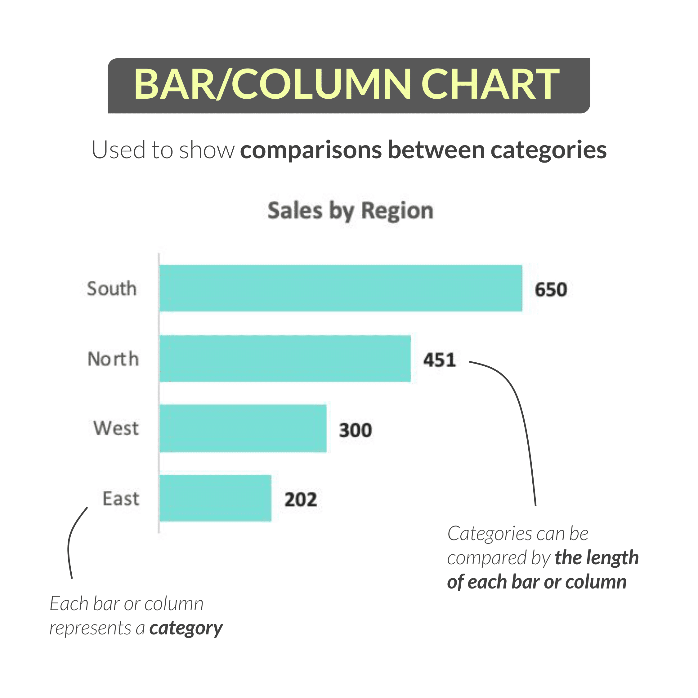
One of the most common and effective visuals is the bar or column chart, which is used to show comparisons between categories.
One reason people favor bar and column charts over pie or donut charts is that it’s very easy to see the relative differences between values; for these visuals, each bar or column represents a category that can be compared by height or length.
In this case, we’re looking at a bar chart showing sales by region (South, North, West and East). (If we rotated these bars vertically, we would have a column chart showing the same thing.)
In this example, we can easily see that the South region drove the most sales with 650, while the East region drove the fewest with only 202.
Line Charts
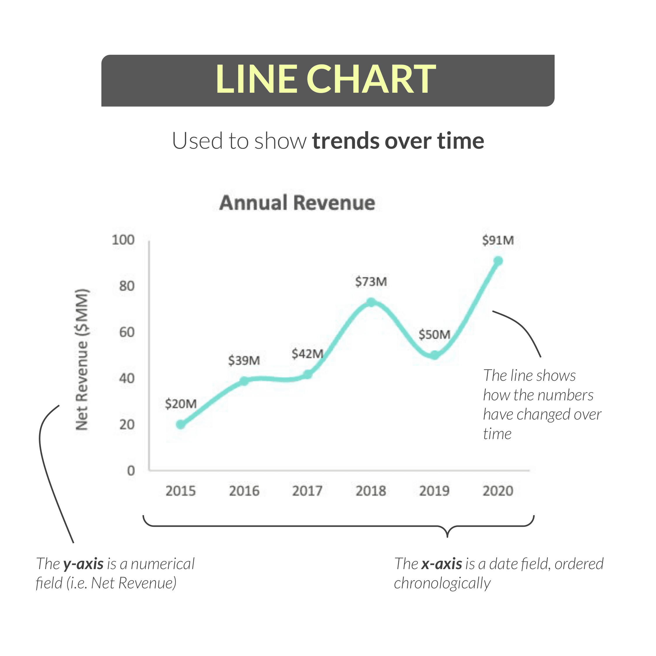
Another extremely common visual is the line chart, which is used to show trends over time.
Above, we have an example line chart showing annual revenue over a six-year period: from 2015 through 2020.
The y-axis (or the vertical axis) is a numerical field (in this case, net revenue), the x-axis (or horizontal axis) is a date field (like day, week, month, year) ordered chronologically.
Meanwhile, the line itself shows how those values have changed over time.
In this example, we see that revenue climbed to $73M in 2018, dipped to $50M in in 2019, and peaked at $91M in 2020.
Pie and Donut Charts
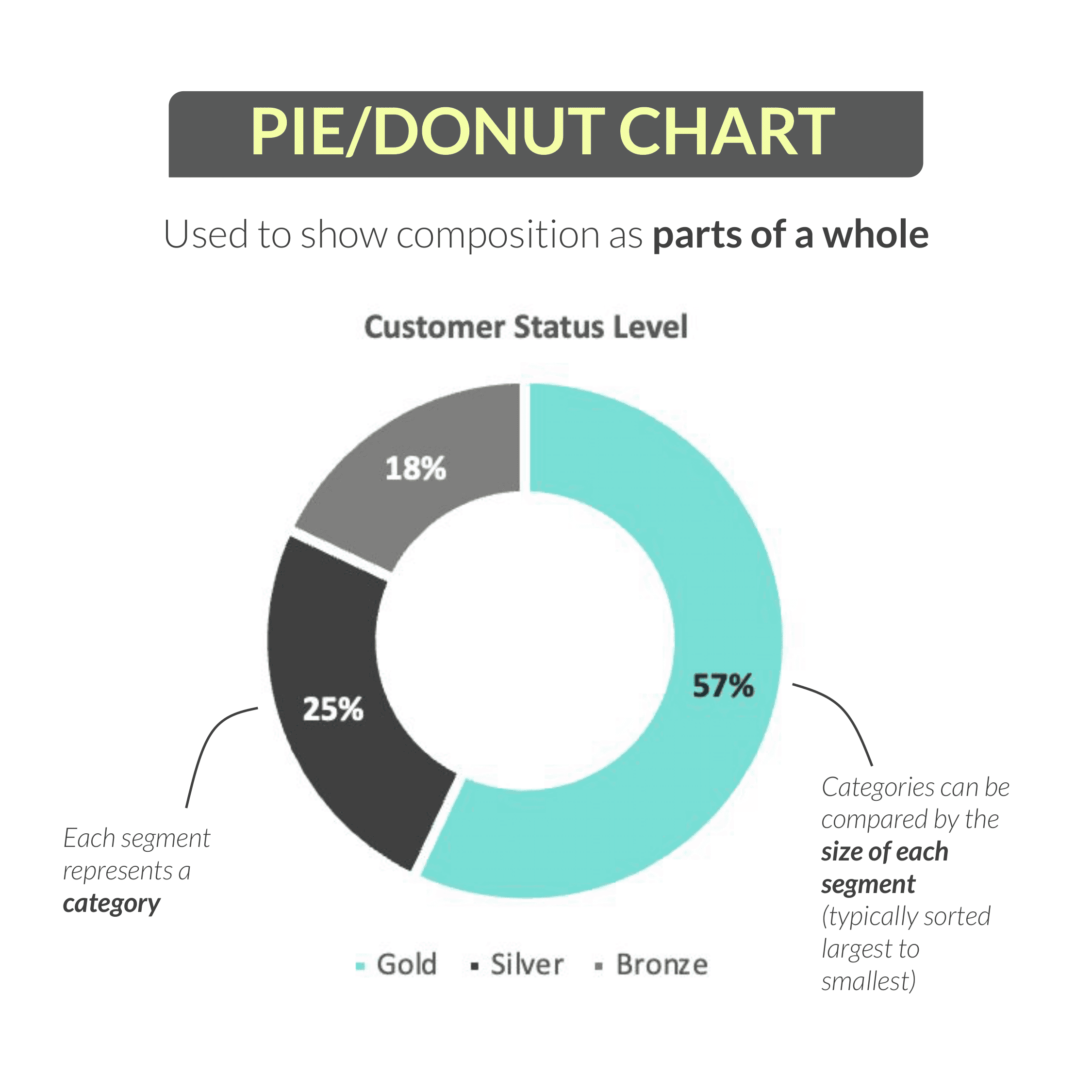
Perhaps the third most common visual you’ll see, and one that tends to be quite polarizing in the data community, is the pie or donut chart. These are used to show composition as parts of a whole.
Here we see a donut chart (which is really just a pie chart with a hole in the middle) showing the percentage of customers in each status level (Gold, Silver, and Bronze).
Each segment of the donut represents a category, which can be compared by size. (As a best practice, these segments should be sorted largest to smallest – just like they are here.)
In this case, we can see that more than half of our customers (57%) have Gold status, followed by Silver at 25%, and Bronze at 18%.
If you’re curious: the reason why some people are so opposed to pie charts is that it can be difficult to compare angles or sizes of similar segments, especially compared to a bar chart.
My personal stance is that pies and donuts are perfectly valid under the right circumstances, which is that you show no more than 3-4 segments, you use clear data labels, and you sort your categories in descending order.
Clustered Bar and Column Charts
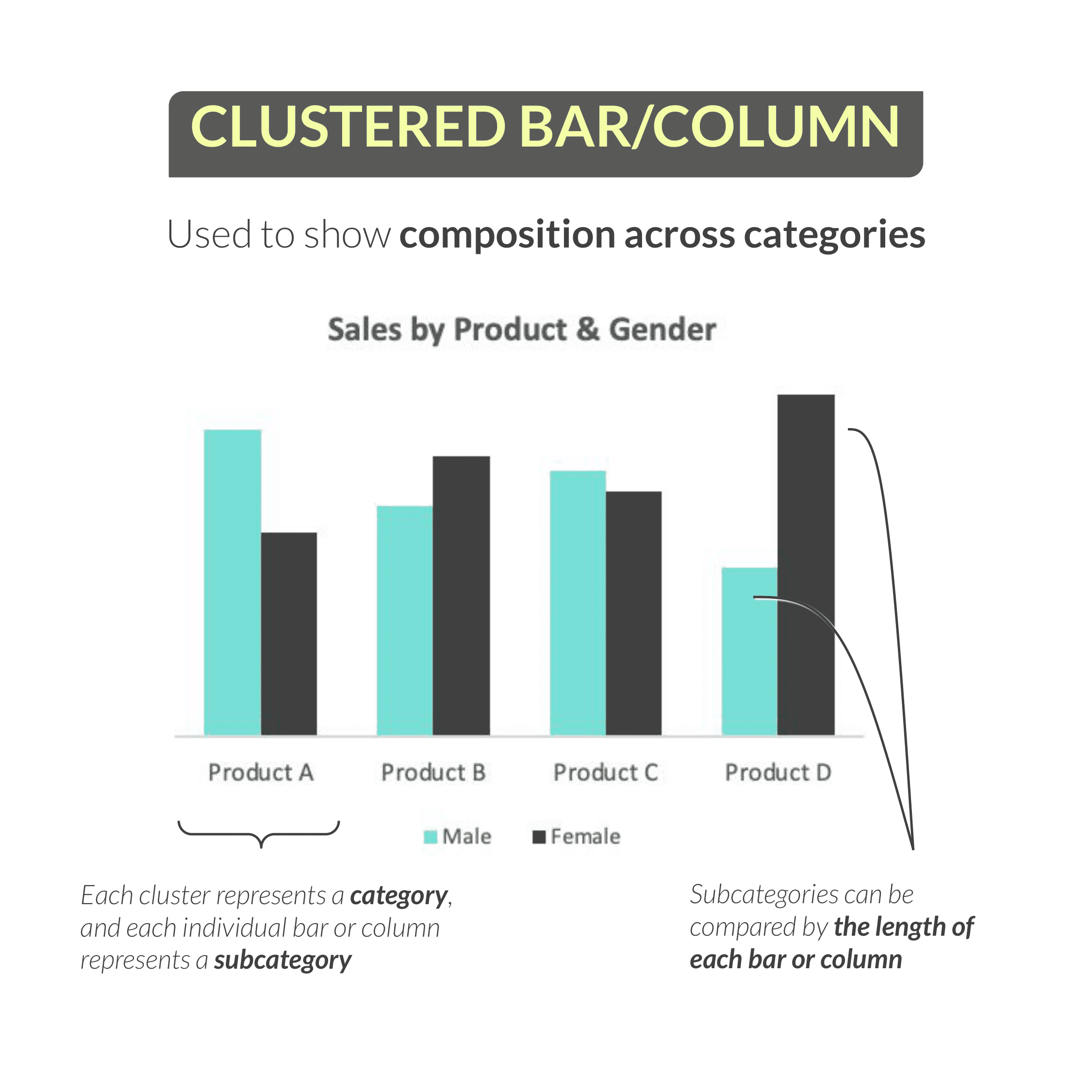
Next, we have the clustered bar or column chart, which is used to show composition across categories.
So here we have a clustered column showing sales by both product and customer gender. Each cluster represents a category (in this case, product), and each individual column within that cluster represents a subcategory (in this case, gender).
Just like a traditional bar or column chart, those subcategories can be compared by the lengths of the bars or the heights of the columns.
In this example, we see that products A and C skew towards male customers (based on the height of the blue columns compared to the dark gray columns), while products B and D skew towards females.
Stacked Bar and Column Charts
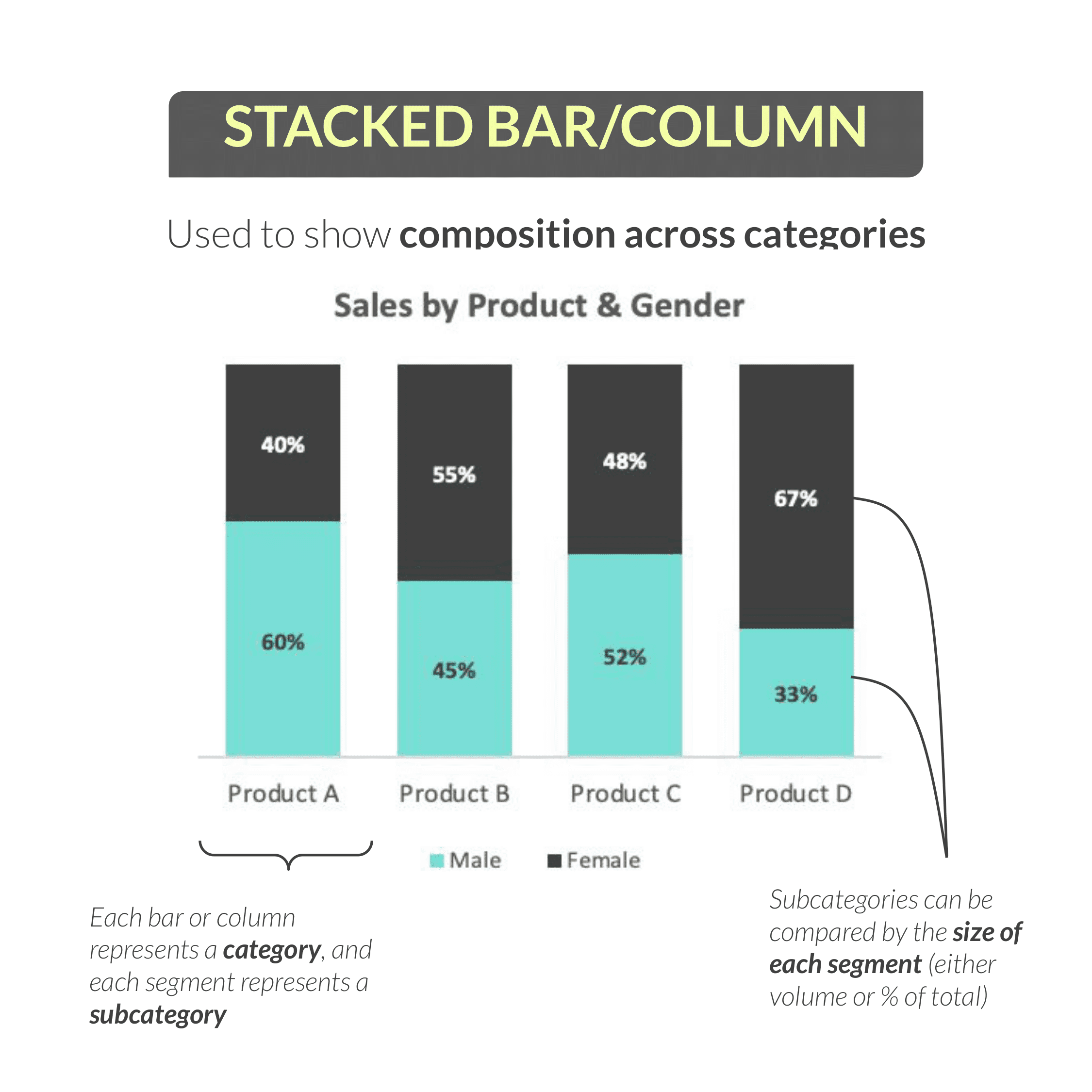
Using the same data from the previous example, we can actually tell the same story in a slightly different way by using a stacked bar or column chart. These are also designed to show composition across categories.
The only difference between the two charts is that, instead of clustering columns side by side, we’re stacking them on top of each other. You can either stack them based on their actual volume (in which case each stacked column would be a different height), or you can show them as percentages of the total (which is what you see here).
This example is similar to before: each column represents a category (or product) and each segment within the column represents a subcategory (or gender). By comparing the size of each segment, we can understand the composition of gender for each product sold.
The takeaway here is that male customers account for 60% of sales for product A, but only 33% of sales for product D.
Area Charts
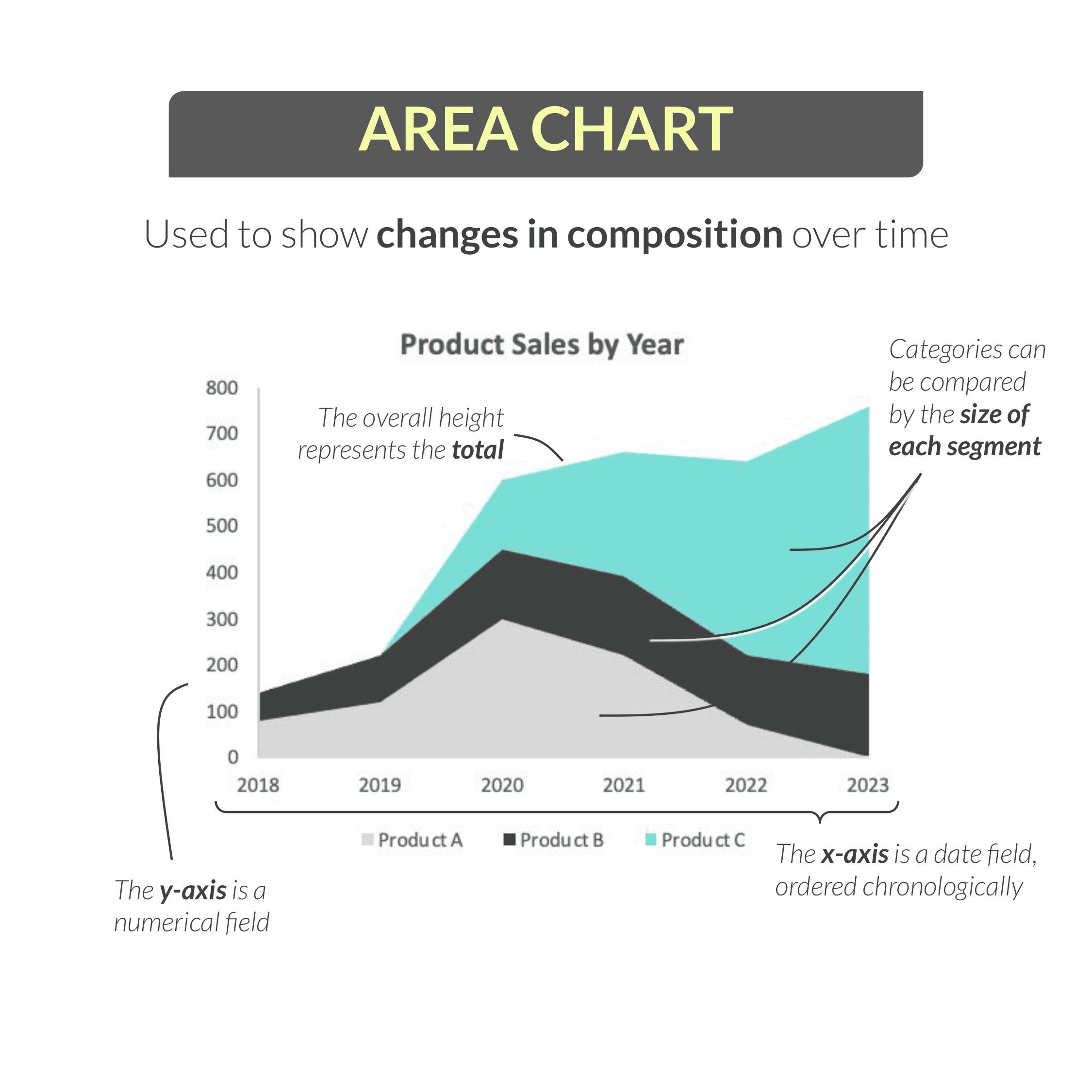
Next up is one of my personal favorite visuals: the area chart. Area charts can be used to show changes in composition over time.
Consider this example, showing product-level sales by year. On the y-axis, we have a numerical field (sales), while on the x-axis, we have a date field (year).
We can interpret this chart by looking at the overall height of the area (in this case, total sales) or by comparing individual categories (in this case, products) based on how the size of each individual segment changes over time.
Area charts are amazing because they pack so much information into a single visual, but they can be a bit tricky to interpret at first.
Looking at this example, it can be helpful to focus on one segment at a time:
Product A, in light gray, accounted for about half of all sales in 2020 before tapering off in the following years.
Product B, in dark gray, grew slightly but remained pretty stable over time.
Product C, in bright blue, seems to have launched in 2020 and grown each year to the point where it now accounts for the majority of total sales in 2023.
We’re able to get a really clear picture of the product mix in this chart, and how that composition changed over time.
Note that this particular example is a stacked area chart, which is most common, but there are other variations.
Scatter Plots
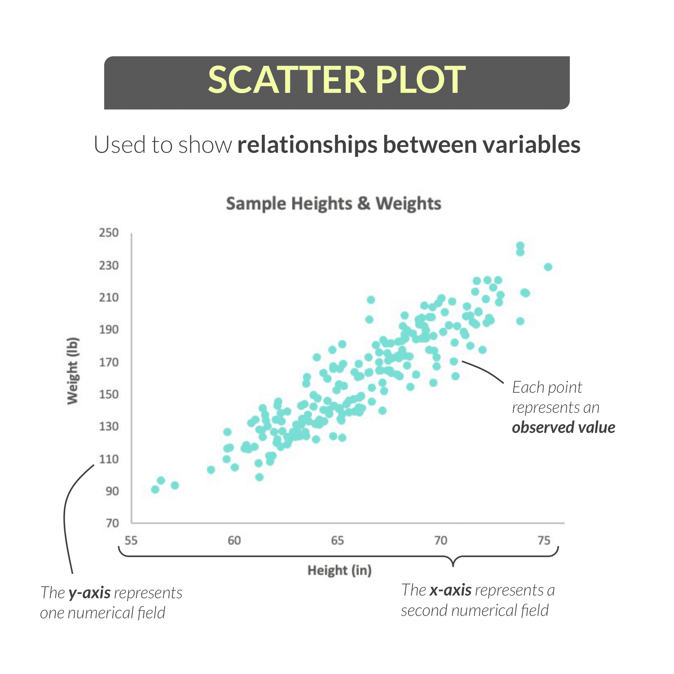
The last few charts I’ll share are a bit more specialized, but still quite common.
Here we have a scatter plot, which is specifically used to show the relationship between two variables.
With scatter plots, the y-axis represents one numerical field, and the x-axis represents a second numerical field. In this example, we’re looking at heights and weights for a population sample.
Note that we aren’t dealing with categories here: instead, each point on the plot represents an observed value (in this case, an individual person) in our sample.
To interpret this visual, we see a strong positive correlation between height and weight. In other words, as height increases (as we move further to the right on our x-axis), weight tends to increase as well.
Keep in mind that correlation does NOT imply causation. A scatter plot can tell us that two variables move in the same direction (like shark attacks and ice cream sales), but it cannot tell us that one variable CAUSED a change in the other.
Filled Maps
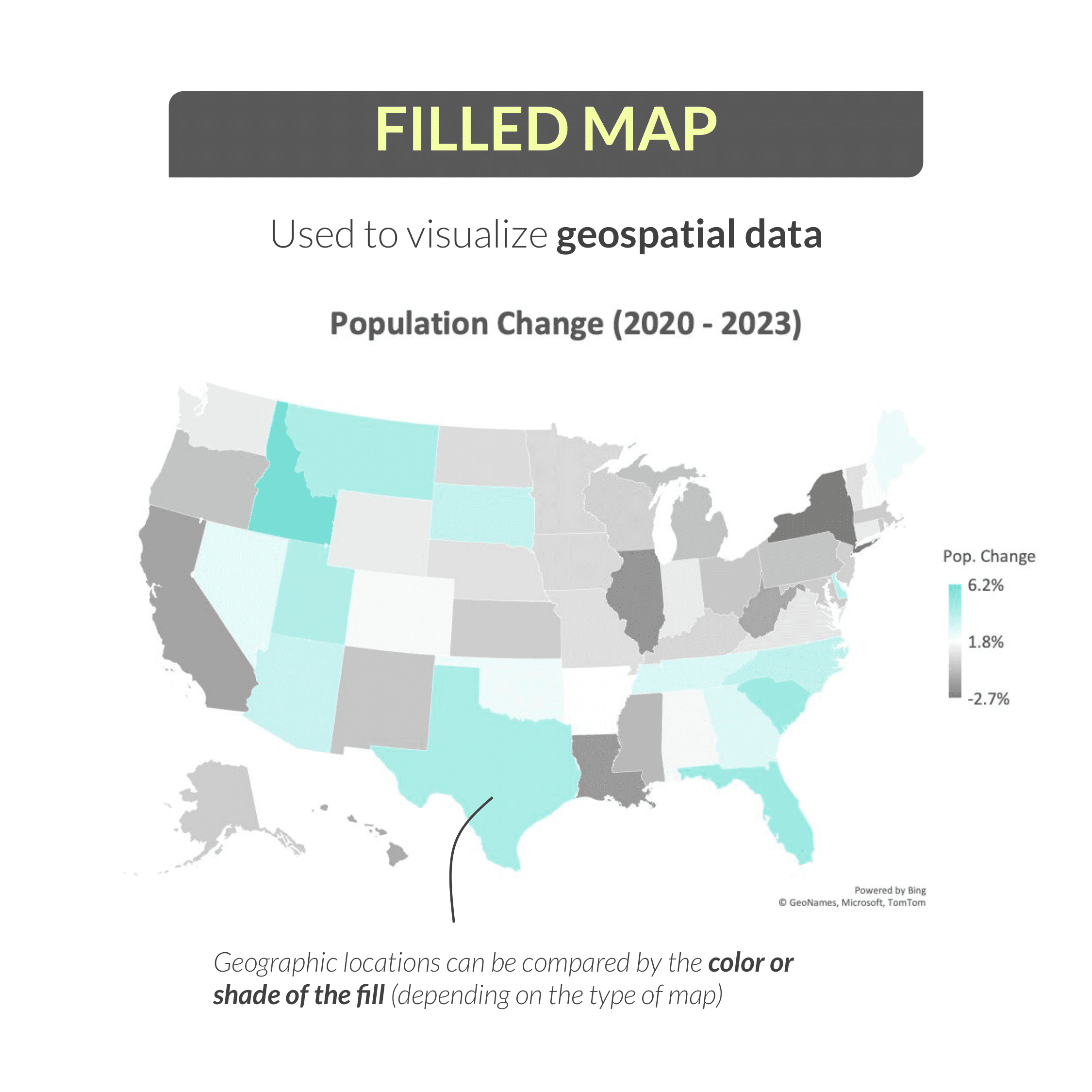
Next up is a pretty simple visual: the filled map. As you might expect, a filled map is used to visualize geospatial data.
Here we see a map of US states, where the color or fill of each state represents the population change from 2020 – 2023. States with a large population increase over that period are shown in blue, and states with a large population decrease are shown in dark gray.
Interpreting this example, we can see that Idaho and Florida were among the fastest-growing states during this period, while New York and Illinois (among others) saw populations decline.
Dual-Axis Charts
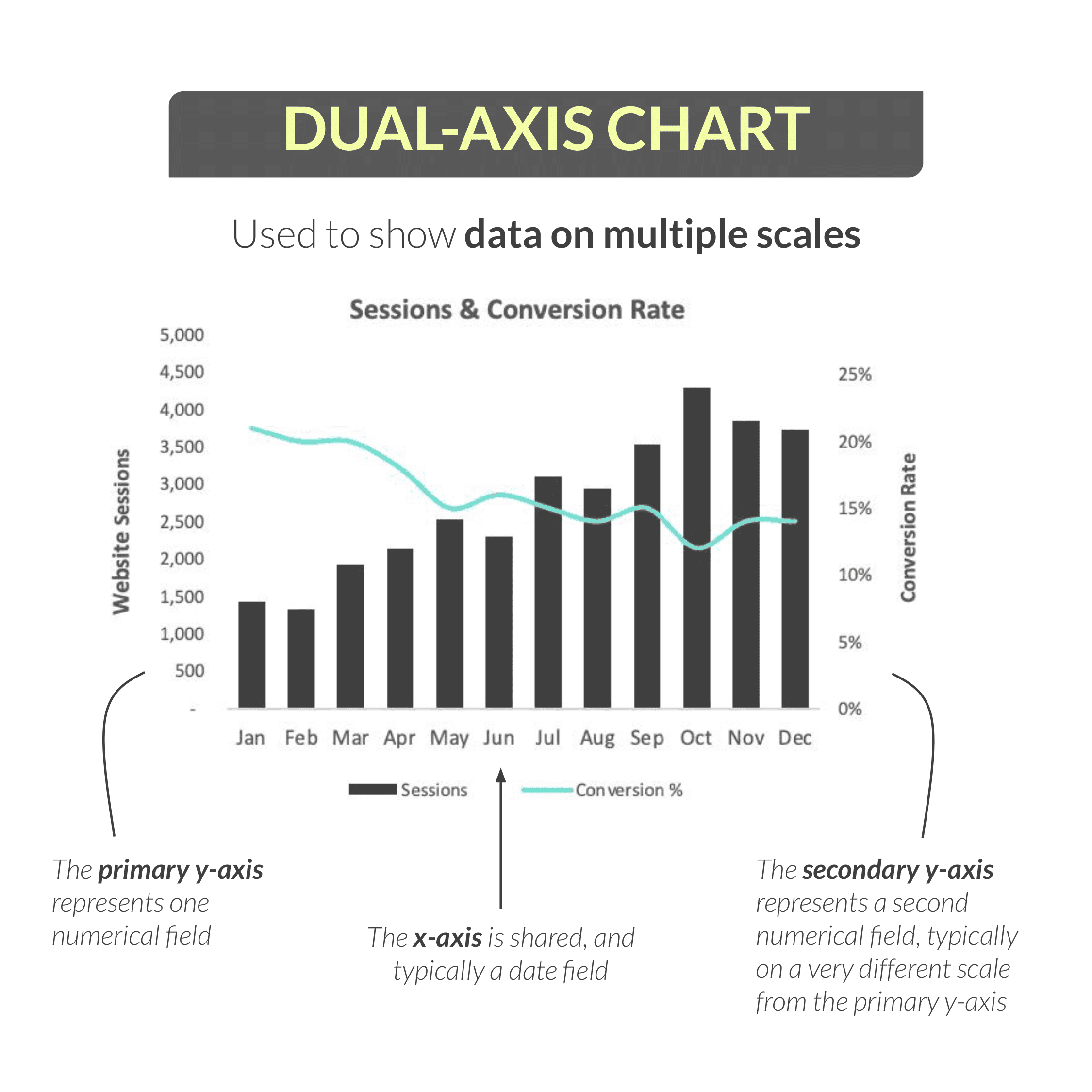
The final chart I want to cover is the dual-axis, or “combo”, chart, which can be used to show data on multiple scales.
This example is showing two different metrics – website sessions and conversion rate – which would be impossible to show using a single y-axis because they are on completely different scales. (In this case, there are thousands of sessions per month, but the conversion rate is a percentage that falls between 0 and 1.)
For a dual-axis chart like this one, the primary y-axis (on the left) represents one numerical field, the secondary y-axis (on the right) represents a second numerical field, and the x-axis (typically a date field) is shared between the two.
This is where chart legends and axis titles are really important for readability and clarity.
In this chart, we can clearly see that sessions are displayed as dark gray columns and map to the primary axis, while conversion rate is shown as a blue line and maps to the secondary axis.
Interpreting this chart, we can see that website sessions generally trended up from January to December, peaking in October, while the conversion rate dropped from ~20% to 15% over the same period.
One word of warning here: a dual-axis chart should never be used purely to make a pattern or trend more distinct or dramatic, which can end up being quite misleading. It’s really designed for cases like the above example, where you want to show the interplay between two metrics that are related but measured in very different ways.
Final Thoughts
Now there are many, many more types of charts and graphs that you may encounter, but hopefully this gives you a good primer on how to interpret some of the most common ones.
If you’re looking for an explainer on how to choose the right type of chart for the data you’re working with, you can find that here.
Happy analyzing!


Chris Dutton
Founder & CPO
Chris is an EdTech entrepreneur and best-selling Data Analytics instructor. As Founder and Chief Product Officer at Maven Analytics, his work has been featured by USA Today, Business Insider, Entrepreneur and the New York Times, reaching more than 1,000,000 students around the world.