Data visualization, by definition, is the graphical representation of data and information.
Or, as I like to say, it brings data to LIFE.
The human brain isn’t optimized to interpret numbers and tables of raw data; we need clear patterns and visual cues to help us quickly make sense of complex information.
That’s exactly what makes data visualization such an effective communication tool.
But how do you know what kind of visualization is right for your data so that you CAN communicate effectively?
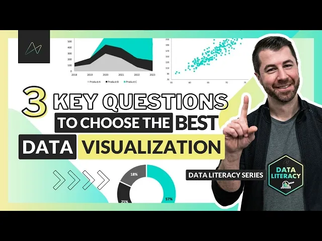
Data Viz 101: Ask these questions
When it comes time to decide how to visualize a data set or which specific chart to use, it’s important to ask yourself 3 key questions:
What type of data are you working with?
Is it geospatial, time-series, categorical, hierarchical, or something more specialized like financial data or survey responses?
What exactly do you want to communicate?
Are you showing a comparison, a composition, a relationship, or a distribution?
Who is the audience and what do they need?
Are you sharing this with an analyst, a manager, an executive, or the general public?
How you answer these questions will help you determine which type of chart or visual is most appropriate, given the context.
Let’s unpack each of these in a bit more detail…
1. Identify what type of data you’re working with.
There are many flavors of data out there, including common ones like…
Time-series
Geospatial
Categorical
Hierarchical
You might also come across some more unique and specialized types of data, like financial statements, text, funnel stages, survey responses, and more.
The key takeaway: the type of data you’re working with often helps determine which type of visual will best represent it.
Some common examples include:
Maps for geo-spatial analysis
Line charts to show time-series
Bar or column charts for categorical comparisons
Other, more specialized examples include things like waterfall charts to track financial balances, Likert scales to summarize survey responses, and even word clouds to visualize information from text-based documents.
2. Understand what you want to communicate with your visualization.
Question 2 is about understanding what you want to communicate, whether it’s a comparison, composition, distribution, or relationship.
Comparison Visuals
Comparison visuals, as the name suggests, are used to compare values over time or across categories.
Common visuals here include variations of bar and column charts, along with line or area charts for showing time-series.
A less common example might be a funnel chart if you specifically want to show sequential stages, like the number of applicants who made it through each round of the hiring process.
Composition Visuals
Composition visuals are used to break down the component parts of a whole.
This is where you’ll typically use stacked bar or column charts, pie and donut charts, stacked area charts for showing composition over time, and maybe things like tree maps or sunbursts if you’re dealing with hierarchical data.
Distribution Visuals
Distribution visuals are useful when you want to show the frequency of values within a series.
By far the most common and effective visual for showing distributions is the histogram, but there are others as well, like box & whisker charts, density plots, or heat maps.
Relationship Visuals
Last but not least, relationship visuals help you show the correlation between multiple variables.
This is typically done using scatter plots or variations like bubble charts, but you might also use tools like a heat map or correlation matrix to show a relationship.
3. Know your audience!
Who is viewing your chart, and what do they need?
One of the most common mistakes that we see people make is that they design their visuals based on what they want to build, not what their audience needs to see.
Designing effective visuals requires a level of empathy, and an understanding of who your audience is and exactly what they’re looking for.
Let’s look at a few profiles of people you’ll run into in your work: the analyst, the manager, and the executive:
The Analyst tends to be someone who wants detail. They like to understand exactly what’s going on at a granular level, so they’re likely to respond well to things like data tables or combo charts, with enough detail to support root cause analysis.
The Manager typically wants summarized data that leads to clear insights that will help them operate the business. For the manager audience, it’s best to stick with common charts and graphs, and only enough detail to support specific insights or recommendations.
The Executive needs high-level, crystal clear KPIs to track business health and topline performance – things like KPI cards or very simple charts, with minimal detail unless it adds critical content to those metrics.
The bottom line: how you choose to visualize and present data is very much a function of who will be consuming it.
Analysts or data specialists may want to see granular detail or complex charts, while managers or execs often prefer high-level metrics with a focus on clear, data-driven insights.
Final Thoughts
You might be feeling a little bit lost or overwhelmed given just how many types of visuals are out there, but let me give you some peace of mind – 90% of the time, basic variations of bar, column, and line charts will be the simplest and clearest way to visualize your data.
If you know…
What kind of data you’re using
What you’re looking to communicate
Who you’re creating the visualization for
Then you can find the perfect chart for your next visualization.
Remember: keep it simple, avoid using complex or custom visuals unless you absolutely need to, and make sure to prioritize simplicity and clarity over aesthetics and design.
If you learn better visually, you can also find all of this information shared here on our YouTube channel:
And if you’re a beginner looking to build your own data literacy skills even further, check out our Data Literacy Foundations course.
Happy learning!


Chris Dutton
Founder & CPO
Chris is an EdTech entrepreneur and best-selling Data Analytics instructor. As Founder and Chief Product Officer at Maven Analytics, his work has been featured by USA Today, Business Insider, Entrepreneur and the New York Times, reaching more than 1,000,000 students around the world.