__STYLES__
Discover
Business
Showcase
Testimonials
Pricing
Log In
Sign Up
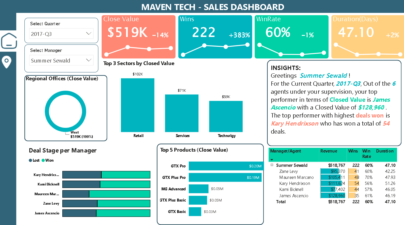
Maven Tech -CRM Sales Dashboard
Alexis Gamboa Avatar
Alexis Gamboa
Medicard Phils
Tools used in this project
Share
Power BI Maven CRM Sales Challenge
Additional project images
View source data
Alexis Gamboa Avatar
Alexis Gamboa
Medicard Phils
More projects by Alexis
How Daily habits affect Academic Performance
0 Likes
0
0 Comments
0
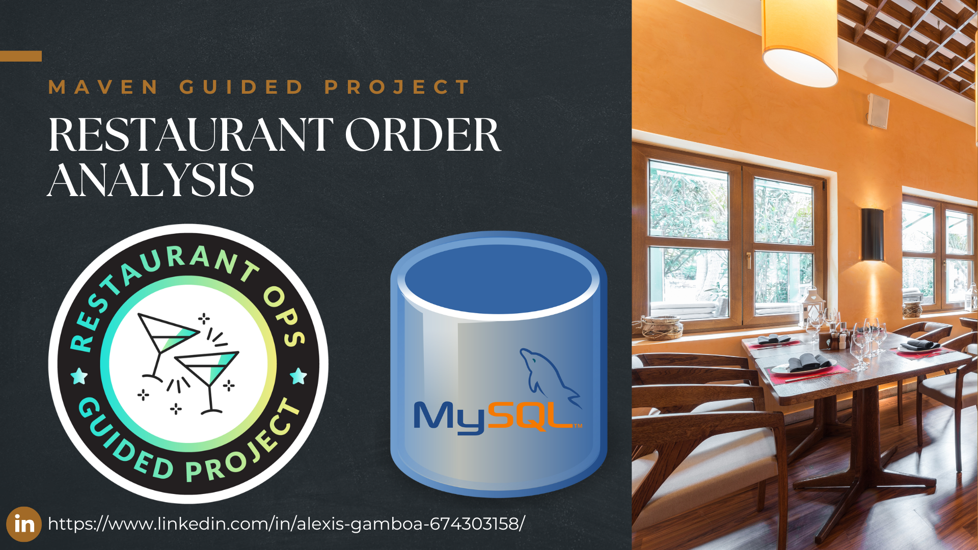
Restaurant Order Analysis
0 Likes
0
0 Comments
0
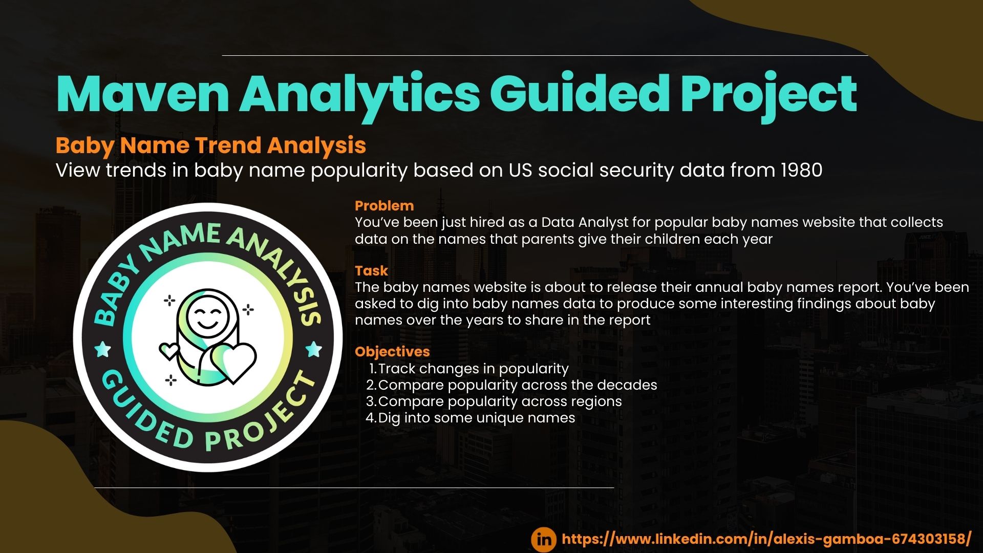
Baby Name Trend Analysis
0 Likes
0
2 Comments
2
Discussion and feedback
(0 comments)
Leave a comment
2000 characters remaining
Sign in to comment
Cookie Settings
We use cookies to enhance your experience, analyze site traffic and deliver personalized content. Read our
Privacy Policy
.
Only Necessary
Accept All